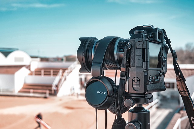
Why Color Grading Matters
Like it or not, viewers judge fast. Before a single word’s been spoken, the color of your video shapes the story they think they’re stepping into. Cool tones signal calm or detachment. Warm hues feel personal, inviting. High contrast grabs attention. Muted palettes build atmosphere. Your color choices do more than make footage pretty—they set the emotional tone on contact.
Color grading goes one step further. It locks in that visual voice across every episode, giving your channel a recognizable, polished look. Whether you’re a travel vlogger sharing sunset coastlines or a tech reviewer aiming for a clean, minimal feel, color consistency links one video to the next.
And here’s the kicker: audiences notice—even if they don’t know the term “color grading.” They associate tightly styled visuals with creators who have their act together. It’s a subtle cue that says you’ve put in the work. Doesn’t have to be flashy. Just needs to feel intentional every time the viewer hits play.
Know the Difference: Color Correction vs. Color Grading
Let’s break it down. Color correction is the cleanup phase. It’s about making your footage look natural and accurate—fixing exposure issues, dialing in the white balance, and bringing contrast to a realistic level. This is where you make the footage usable, balanced, and true to life, especially if you shot in log or flat color profiles.
Color grading comes after. That’s where you add style, mood, or emotion. You’re not just making it accurate—you’re making it yours. Think warmth for a morning coffee vlog, or a cooler tone for a moody travel piece. Grading is about storytelling through color.
Here’s the rule: correct first, grade second. Skipping correction makes grading harder and inconsistent. Doing it out of order can wreck skin tones and create artifacts you didn’t notice until it’s too late.
Get the technical stuff right upfront—then flex your creative chops.
Apply a Base Look or LUT
Once your footage is corrected and balanced, it’s time to give it a vibe. That’s where a LUT, or Look-Up Table, comes in. Think of a LUT as a smart filter—a shortcut to a specific mood or style. It maps out what colors and contrast should look like, instantly applying a base grade. The key is not to slap it on and call it finished. Step one is choosing a LUT that actually fits your content. Cinematic LUTs bring out teal-orange drama. Warm tone LUTs feel cozy and soft. Vintage LUTs can soften the image and pull in retro hues. Pick one with intent, not just aesthetics.
Next up: adjust the intensity. A LUT at full strength often goes overboard. Dial it back to blend naturally with your footage. If the contrast punches too hard or skin tones shift too far, scale it down. What you’re after is enhancement, not distraction.
LUTs are a time-saver, but they aren’t a finish line. Use them as a foundation, then build your own grade on top. Most successful vloggers adapt their LUTs to match their brand and lighting—don’t expect plug-and-play perfection. It’s about finding a look that carries your story without overpowering it.
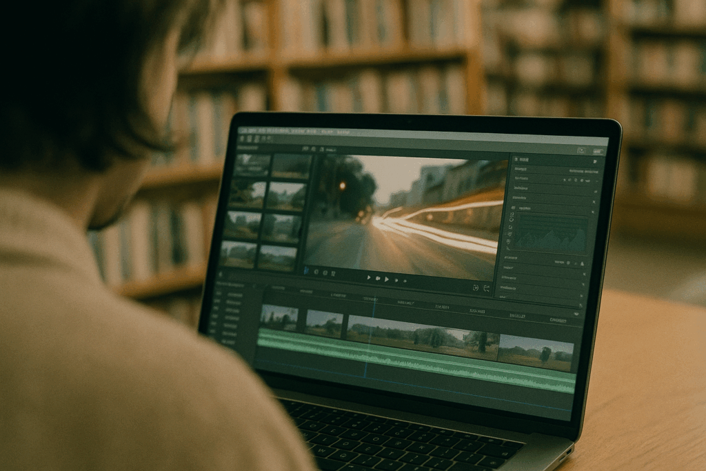
Tools of the Trade
When it comes to color grading, your editing software matters. The good news? You don’t need a Hollywood setup to get polished, cinematic looks. Here’s a snapshot of what most vlog creators are relying on in 2024:
Premiere Pro + Lumetri Color Panel Adobe’s Lumetri Color Panel is built into Premiere Pro and is perfect for vloggers who want pro-looking results without steep learning curves. It’s visual, intuitive, and fast. You can dial in a look with sliders and scopes, then save it as a preset. If you’re already cutting your vlog in Premiere, this is the path of least resistance.
DaVinci Resolve This is the gold standard for color work—and the free version is surprisingly loaded. Resolve gives you node-based grading (great for complex looks), powerful skin tone tracking, and pro scopes. The UI is more technical than Premiere, but the payoff is big if you’re willing to climb the curve. For creators who take color seriously or want to stand out visually, Resolve delivers high-end control without the sticker shock.
Final Cut Pro + Color Board Mac users love Final Cut for speed—and the Color Board slots right into that workflow. It’s quick, optimized for Apple hardware, and clean enough for creators who don’t want to fuss with too many dials. You won’t get the nuance of Resolve here, but if you care about turnaround time and system performance, it’s a solid pick.
Choosing the right tool isn’t about flashy features—it’s about what fits your setup, your budget, and your creative goals. For a detailed comparison across platforms, check out Top Video Editing Software for Vloggers.
Common Mistakes to Avoid
Color grading can elevate your vlog or sink it—depending on how it’s handled. One of the most common missteps is overshooting saturation or crushing the blacks to oblivion. Pushed too far, these tweaks kill dynamic range and make your footage look cheap, not cinematic.
Next up: LUT abuse. Yes, LUTs are powerful, but they’re not one-click magic. Slapping one on without correcting your footage first is like painting over a cracked wall. You need a solid base—accurate exposure, white balance, contrast—before you layer in any style.
Consistency matters too. Jump cuts between scenes that don’t match tonally can turn viewers off fast. Whether you’re using different cameras or filming in shifting light, your grading needs to stitch everything together with cohesion.
And perhaps the most critical mistake? Skipping grading altogether. Raw, uncolored footage might save you time, but it sells your content short. Even a light polish can drastically improve perceived quality. Your audience might not know why your vlog feels pro or amateur, but they’ll feel it. Always grade—just don’t overdo it.
Pro Tips from Vlog Creators Who Nail It
One thing sets top vloggers apart: they don’t rely on cookie-cutter grading. They build their own LUTs over time, shaping a customizable look that reflects their personal style. It’s not about reinventing every video—it’s about knowing what “your look” feels like and designing it with intent. If you’re still slapping on free LUTs and calling it done, it’s time for a level-up.
Start saving grading presets based on your different vlog styles—travel, indoor setups, low light, golden hour. There’s no one-size-fits-all when your environments change constantly. Having precision tools ready saves hours and keeps your visual brand tight.
Don’t grade in a vacuum, either—literally. Grading in poor lighting, on cheap displays, or at 2 a.m. is a shortcut to inconsistency. Use natural daylight or a calibrated monitor when possible. Your edits are only as accurate as what you’re looking at.
Lastly, stop watching top-shelf creators just for their transitions or drone shots. Study their tone. How do their colors feel? Warm and nostalgic? Crisp and clean? What feeling do they leave with you? Borrow intentionally.
Professional color isn’t complicated—it’s disciplined. Do these small things well, and your visual identity will take care of itself.
Final Thoughts
Color grading isn’t just a finishing touch—it’s part of how you tell your story. The colors you choose affect how your audience feels, whether they notice it or not. Warm tones can make a vlog feel intimate and raw. Cool tones can give it edge or detachment. Slight shifts in hue or brightness can nudge someone toward feeling calm, hyped, or uneasy. These aren’t just technical details—they’re emotional signals.
What separates average creators from standout ones isn’t always gear or editing tricks. It’s control. Being intentional with color shows that you know what you’re doing. It adds a layer of creative maturity that viewers pick up on, even if they can’t explain why your video just feels better to watch.
Spend the time. Tweak until it clicks. Small adjustments, made consistently, shape big impressions over time.
 Aaron Cloutieristics brings a sharp eye for digital innovation to vlogedgevault With a strong background in tech-driven content creation, Aaron focuses on exploring emerging tools, platforms, and strategies that shape the future of vlogging and online media.